 Money in One Chart
where money goes
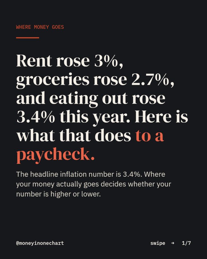
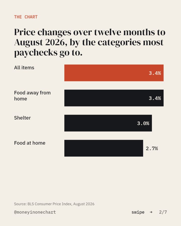
Rent rose 3%, groceries rose 2.7%, and eating out rose 3.4% this year. Here is what that does to a paycheck.
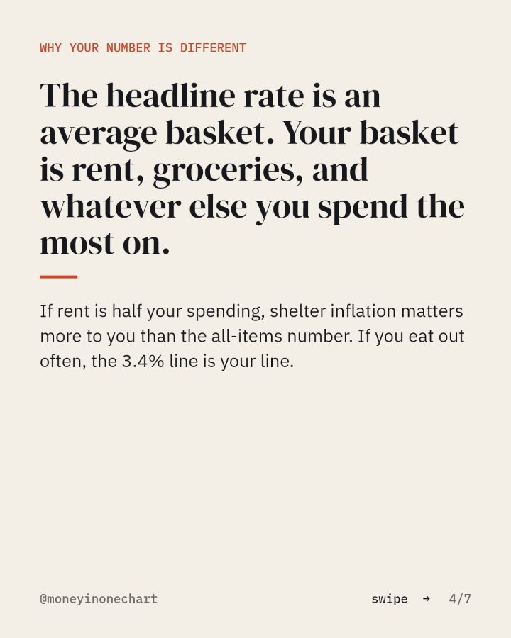
The headline inflation number is 3.4%. Where your money actually goes decides whether your number is higher or lower.
You asked for the personal inflation worksheet. It is below, as the slides from the post, then the one move, then the tool the chart points at.
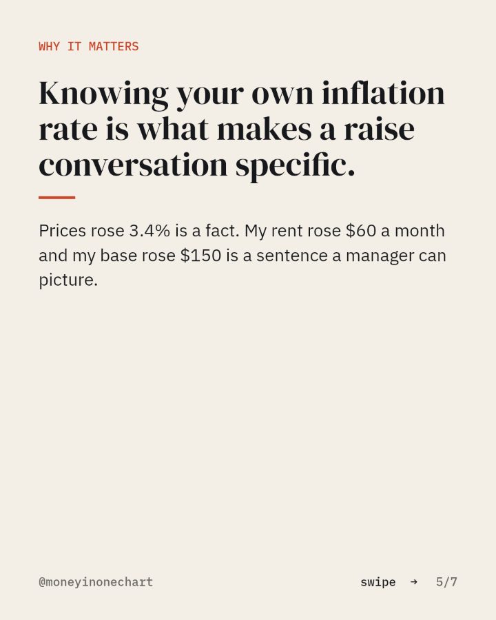
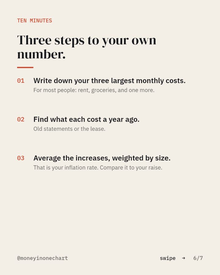
Three steps to your own number.
- 01Write down your three largest monthly costs.For most people: rent, groceries, and one more.
- 02Find what each cost a year ago.Old statements or the lease.
- 03Average the increases, weighted by size.That is your inflation rate. Compare it to your raise.
The tool this chart points at
A high-yield savings account
FDIC-insured, no monthly fee, no minimum balance. Where the emergency fund lives.
Open itThis link may pay Money in One Chart a referral fee if you open an account. Your price does not change. How that works.
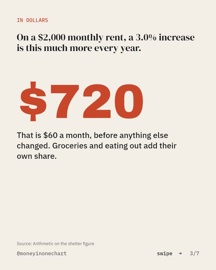
Sources: BLS Consumer Price Index, August 2026; Arithmetic on the shelter figure.